
Web designing is gaining wide popularity among masses these days. The web designs are getting updated each day with newer interactive designs, page layouts, fluid layouts, and motion graphics. So, this platform has been encouraging many visitors since these are attractive and people try to seek cheaper & quicker services over online. For the purpose of making a website a popular one, you need to add user-friendly, attractive templates & graphics.
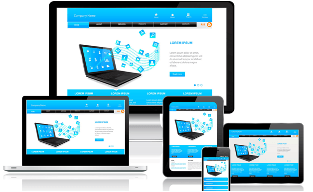
But the next important things is the source of the traffic. In the recent times, the majority of the population spend most of their times on their smartphones. So in order to grab this huge base of customers hovering over these websites on their smartphones, the site must be mobile friendly.
ADVANCED TECHNIQUES IN CONSTRUCTING A MOBILE FRIENDLY WEBSITE
There are a number of ideas about how to make website mobile friendly free of cost. In order to make websites user-friendly, light interfaced and mobile friendly at free of cost here are few techniques, guides and softwareis that acts like a miracle.
- WP Touch
This is used to automatically transform the Word Press websites to be held on the mobile screen. This is laden with all the facilities with the combination of smooth effects which will be supported on smartphones, iPhones, iPods, Androids, Windows and probably all the other types of the devices. The version that is used here is laden with heavy customizations to make his website a user friendly one.
- Mobile theme switchers
Thebest mobile theme switcher can be the use of a plugin. The plugin can set perfect resolutions especially for theimages and the videos so that they can be easily supported on the screen of a phone. There can be a variety of themes from which you can choose to go with each type at a time for each mobile browser.
- Set a width that will be mobile friendly-
After the loading of hiswebsite, you need to get it resized to a form that will fit in the screen size of the narrowest width. This will minimize the side of the window and will be compatible with the user who is visiting it. Doing this needs one to add the Meta tag to the page head giving him the desired size of his screen. Themost important application of this is to fix the size of the website to such a limit so that the user is not facing troubles to zoom it in and out. The view of the screen must be such that it must go equally well with any screen size.
- Setting image width
The image width must be set to 100%. But this can be only possible by setting the width of the website. This will automatically make the images to be displayed in a perfect size. The images will look good and wide, yet won’t be missed out at the edges. At this time, it is 100% width. Nowone needs to add this to the CSS style sheet. Setting on a CSS style sheet will serve well to make the background image resize to a perfect form even if the screen of the user is too small.
- Setting input widths
After setting the widths of the images to 100%, the next thing one needs to do is to add the input fields to the CSS style sheet. This will solve the purpose of not extending the input field sections beyond the size of the screen.
- Submitting buttons
Submitting buttons need a lot of care. Sometimes due to the problem in the network services, there comes a problem is the “Submit” button on his website but the case may be something different at times. It may be like this that the user has to switch from the website to some other application and in the meantime the Submit button gets disabled. These willbe a troublesome thing for the user. This problem can be solved by setting only a few seconds for the delay of the highlighting of the “Submit button”.
- Use of long strings in word wrap
“Wrap” refersto fold up something. A similar concept is used in the case of strings too. There are certain vital long strings like the refer codes, bank account numbers,and even URLs. It becomes a hectic situation to deal with such problems if they come to the edge of the screen. For, this you need to apply the format of word wrap so that it can be adjusted within the narrow screen without the need of scrolling down.
- Extra spaces must be used cautiously

Extra spaces pose a risk to the users when they are dealing with important long strings of numbers on a mobile screen. The common idea that is applied to the display of the longer strings is to break them part wise into a group of 5. Smart users just copy and paste in the location they need to fill this details. Hence the blank spaces that are formed after this stepare quite easy to be deleted from the computer but this is not at all possible on a mobile screen. So, the trick that can be applied here is the wrapping up of the string.
- Standard font’s usage
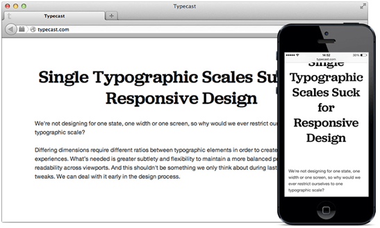
Standard font size can be the one which can be an easy one to be viewed by the user. When one sets the custom fonts, it makes his website to look pretty beautiful but this is not a beneficial one because a user needs a font that can give him better visibility on the mobile screen. For this, one again needs the help of a CSS. The task one has to do is to formulate two sets of rules, one that deals with the default font and the other which is active when the user has to read through it. Only then it can be called a mobile friendly one.
- Fixed positioning must be avoided
This can be done by not limiting the position of the website. When the website has a fixed positioning, it will make it a serious problem when the user zooms through the screen. Zooming will naturally make his header and the side gaps to zoom as well.
From the above tips, it is clear that how only a few ideas can make his website an ultimate friendly one.
CONCLUSION
CSS technology is the one which is being usedforyears to make the website a suitable one to be supported on any kind of screen. But, very few websites are so compatible that they can be a perfect one to be displayed on the mobile screen of any shape and size. So, if you want to makethe website tip of its competitors, it is the necessity of the hour to make the use of such compatible tricks.